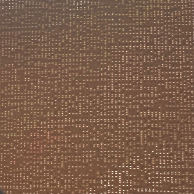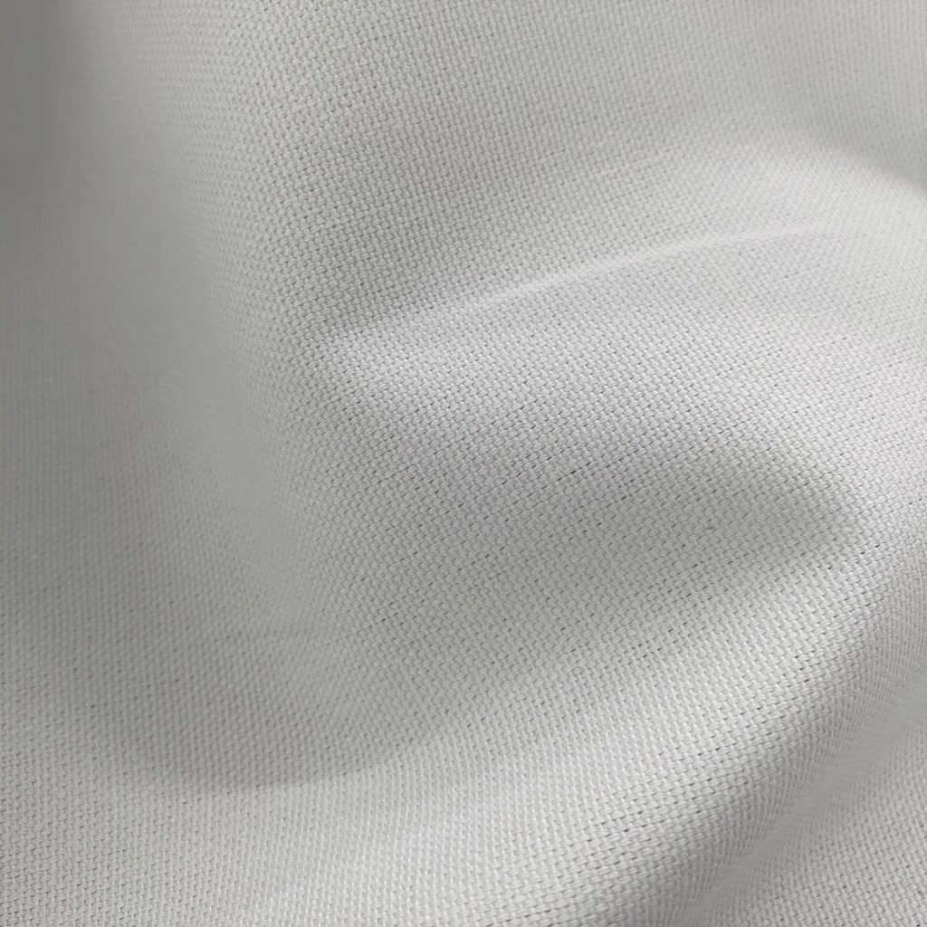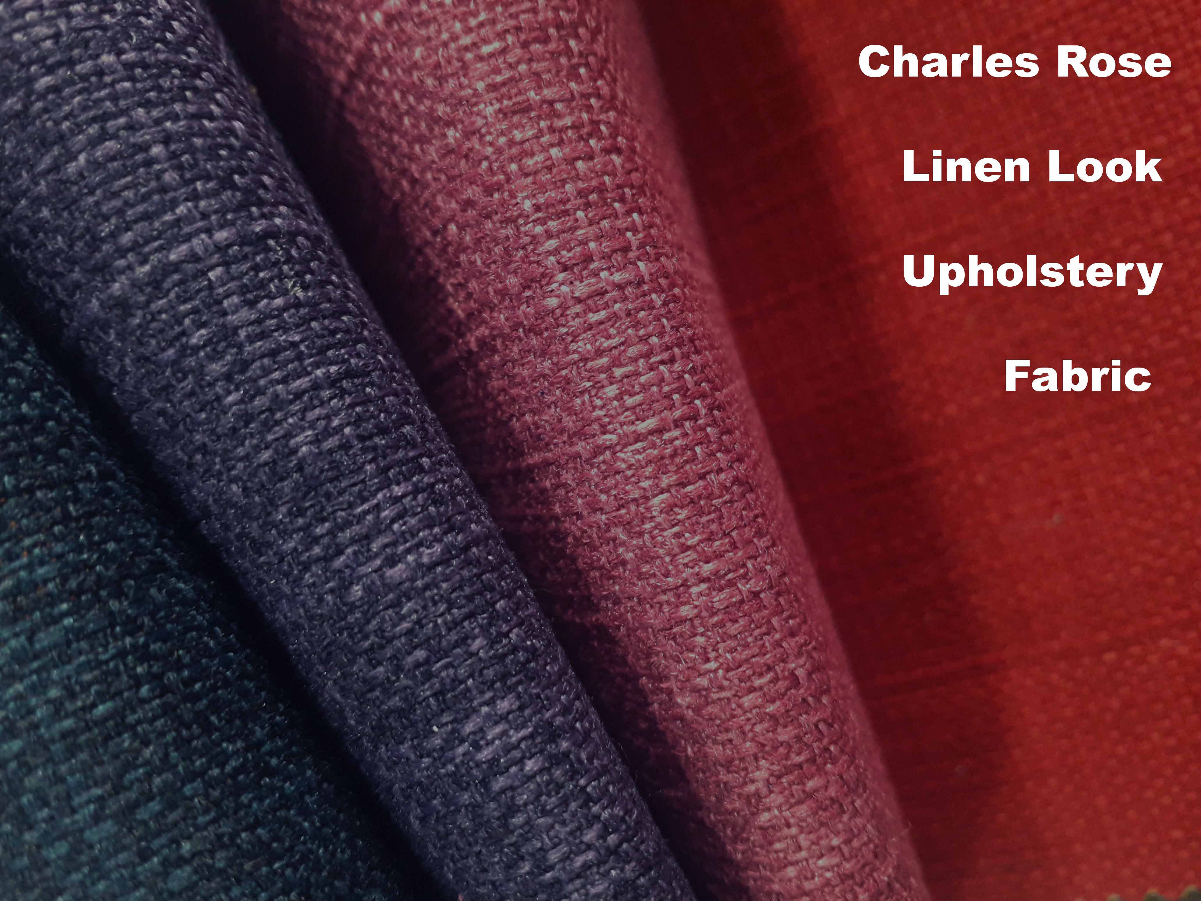
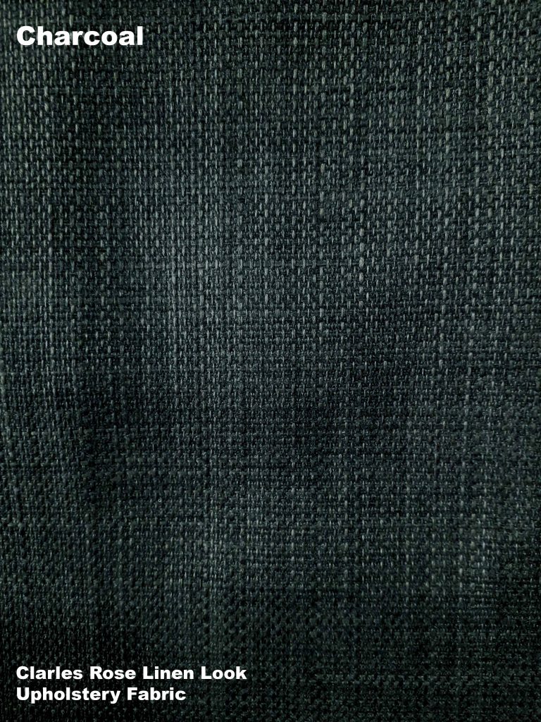
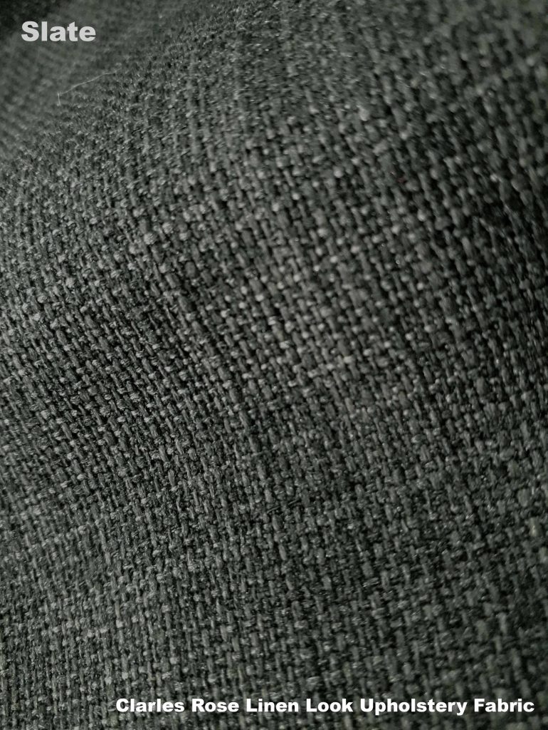
If you are looking for a plain upholstery fabric with a natural woven style then Charles Rose Linen Look is a very popular choice. Bases on the raised texture of woven linen, Charles Rose uses 100% refined polyester to create a soft, yet hard – wearing fabric for upholstery use. Here we take a look at the traditional look shades available.
The Neutral Zone
For calming neutral zone shades, start with soft creams, oat and pale beige shades.
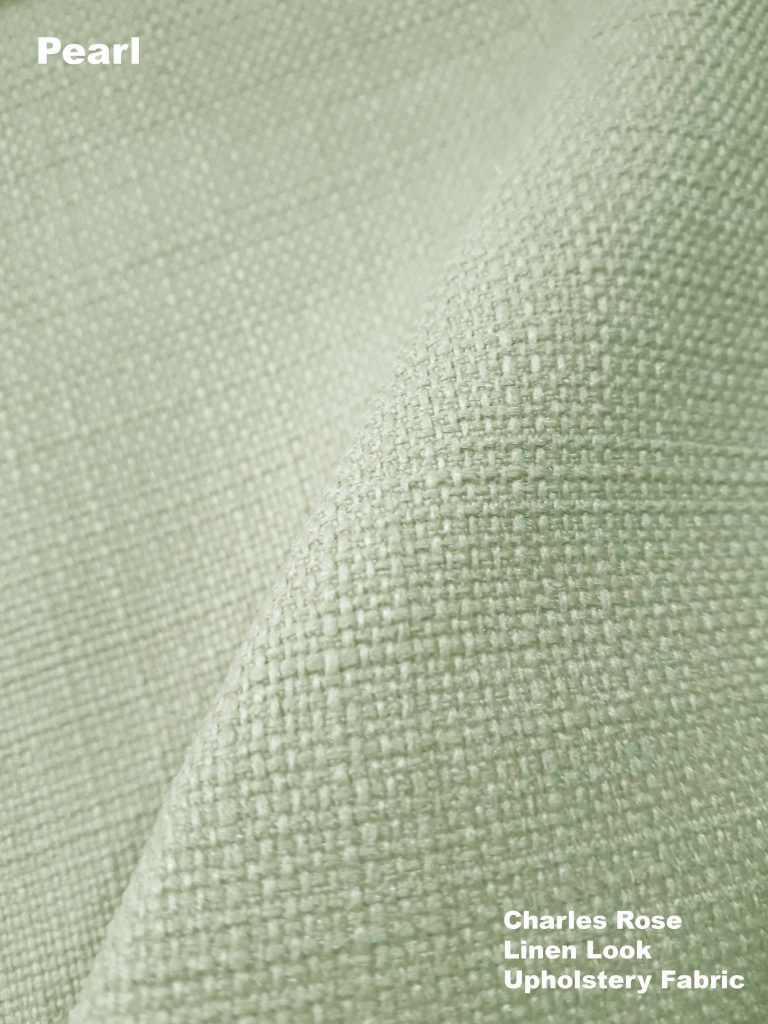

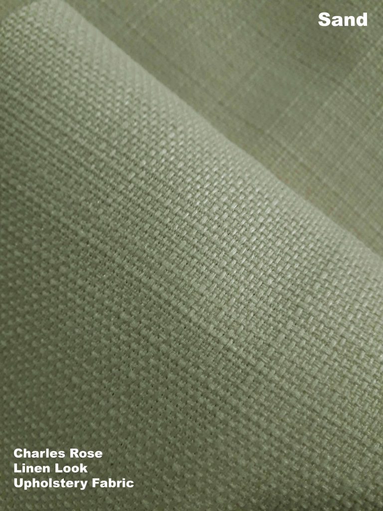
To achieve a light and airy neutral interior, start with light shades as a base to your palate. Use the pale shades in larger areas to cover such as sofas, carpet and curtains.
Mid pale shades like this sand could also be used if you are concerned about the light shades getting too dirty!
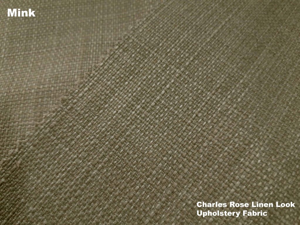
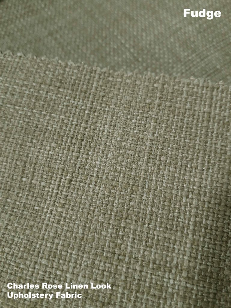
The lighter neutrals of cream and Pearl can be lowlighted by smaller additions of shades of deeper neutrals such as fudge and mink shown here. These warm neutral shades would work as additional shades for, pelmets, cushions, table protectors or detailed hems.
Autumnal Colours
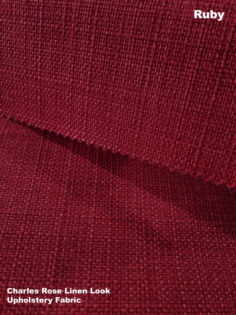
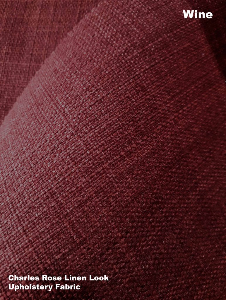
Deep colours inspired by dark woodlands and autumn berries. These shades blend well together and could be warmed up by the addition of russett and deep gold tones.
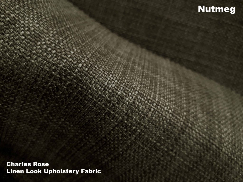
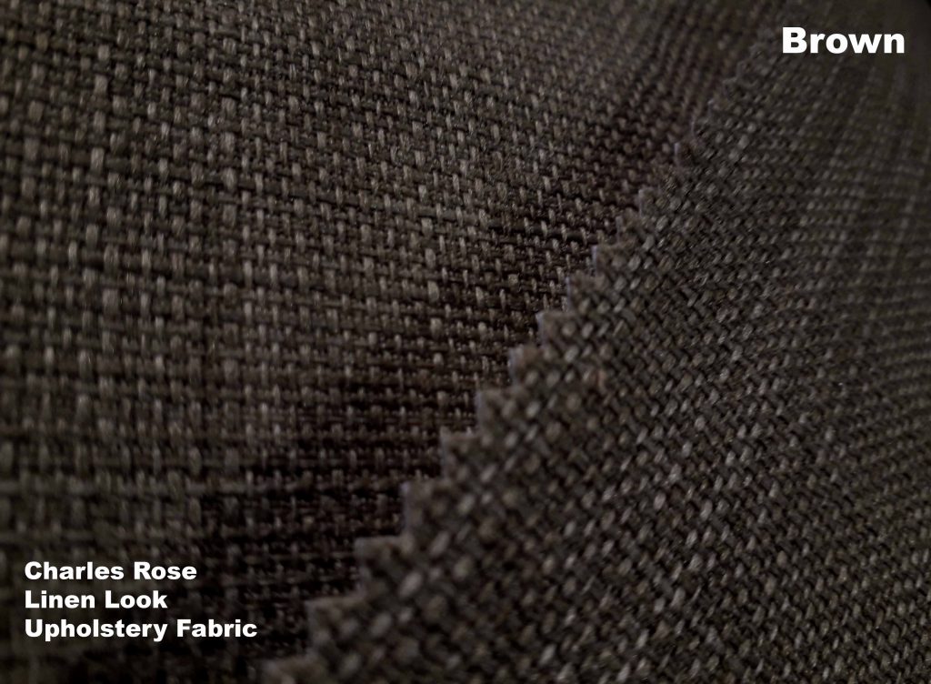
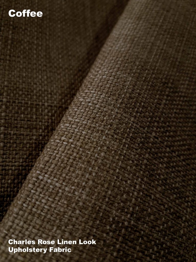
Earthy Interiors
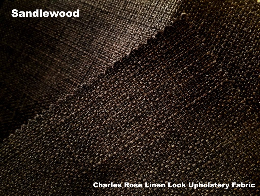
These are all dark tones of brown but with different graduations of warmth. The coffee is the warmest shade with nutmeg comfortably mixing in between that and classic dark brown, a slightly cooler version as you can see.
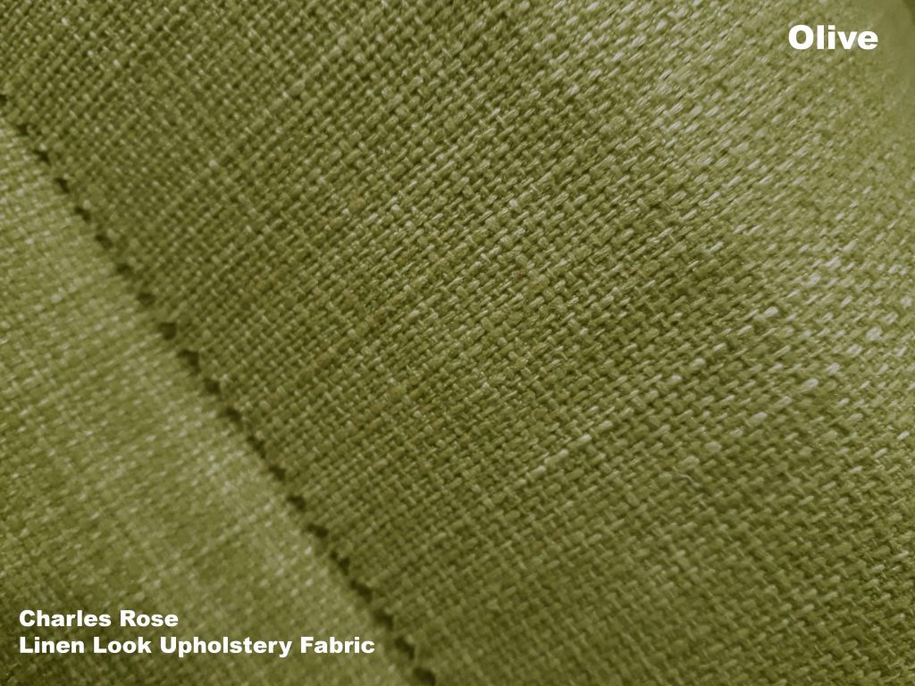
Olive is a good choice to put with all shades of brown from light beige to dark brown. The mid tone and earthy shade of olive blends easily with dark to light interiors.
Grey Tone
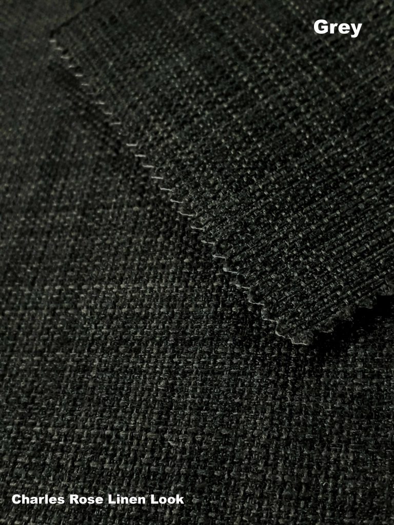
If you want dark shades in your interior but brown isn’t the look you are going for, use grey instead. With brown shades you are limited as to what colours you can place with them. Whereas with grey you can go for all kinds of colours, mid tones, dark shades, pastel even brights. The only shades that don’t always look right with greys are brown colours.
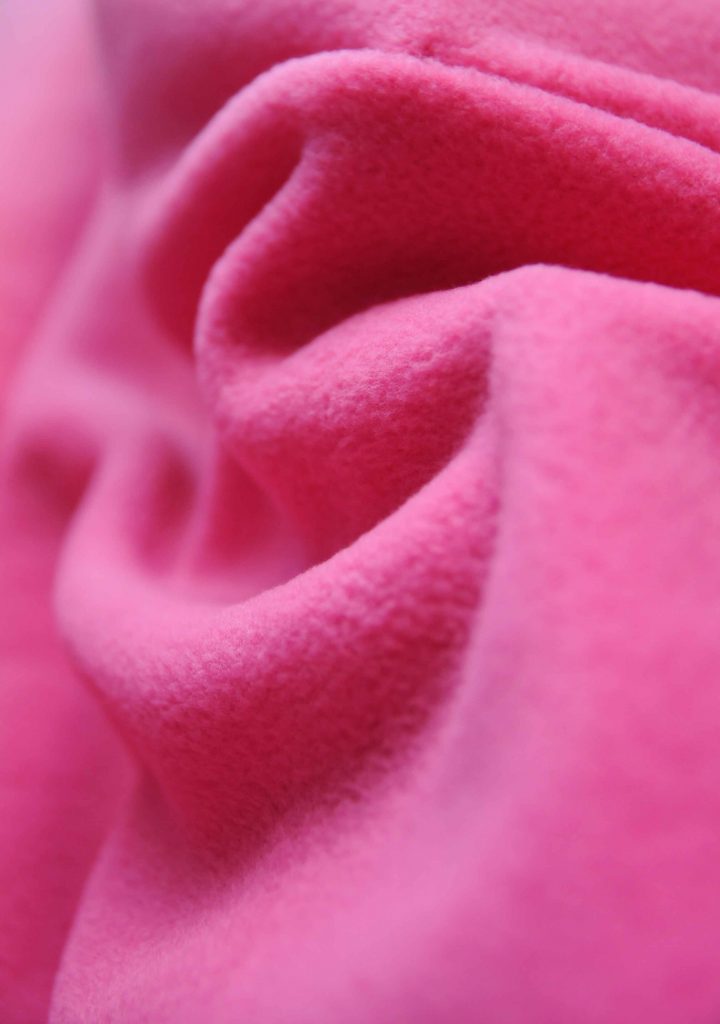
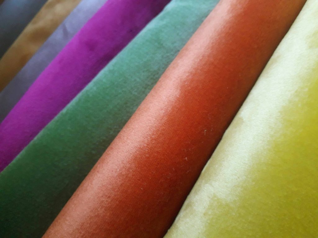
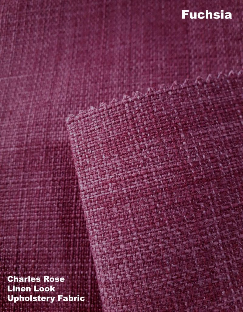
As you can see, all of these colours, however different, all work with grey tones. You could choose one colour to use as a statement or choose a few to mix up. These are just examples of colour and texture for interiors. You don’t have to stick to upholstery fabric, think outside the box. Fleece offers comfort in a vast array of colours to go for. Bright colours such as this cerise pink really pack a punch with grey shades.
Colour Grouping
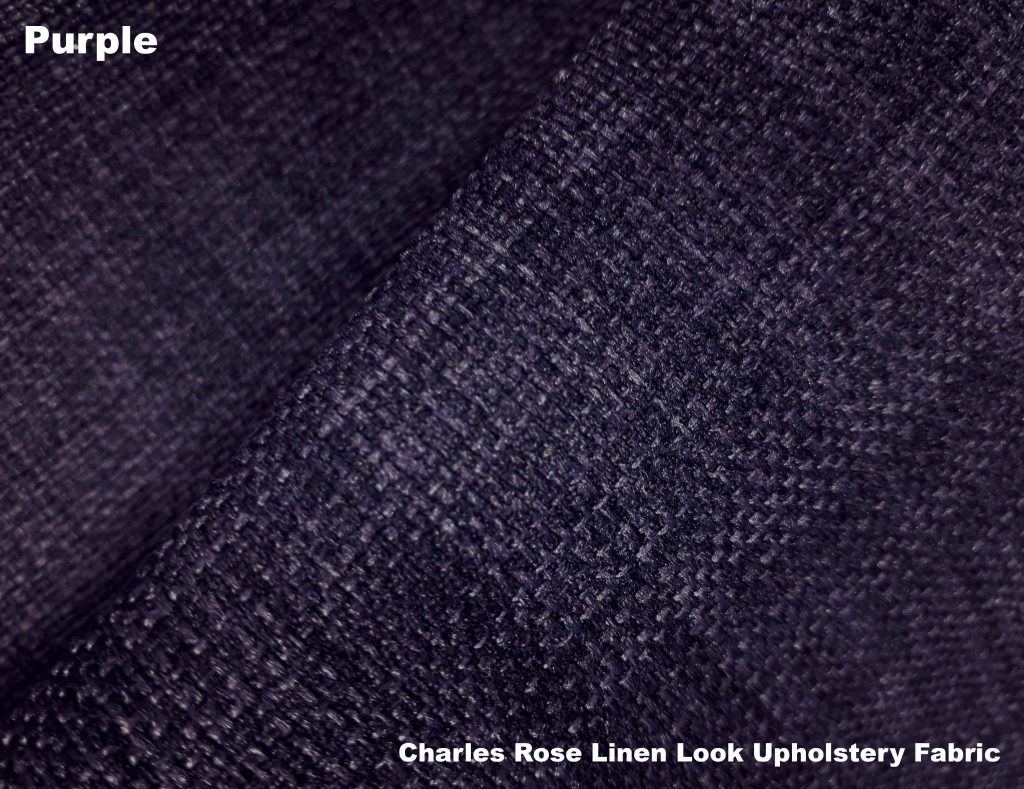
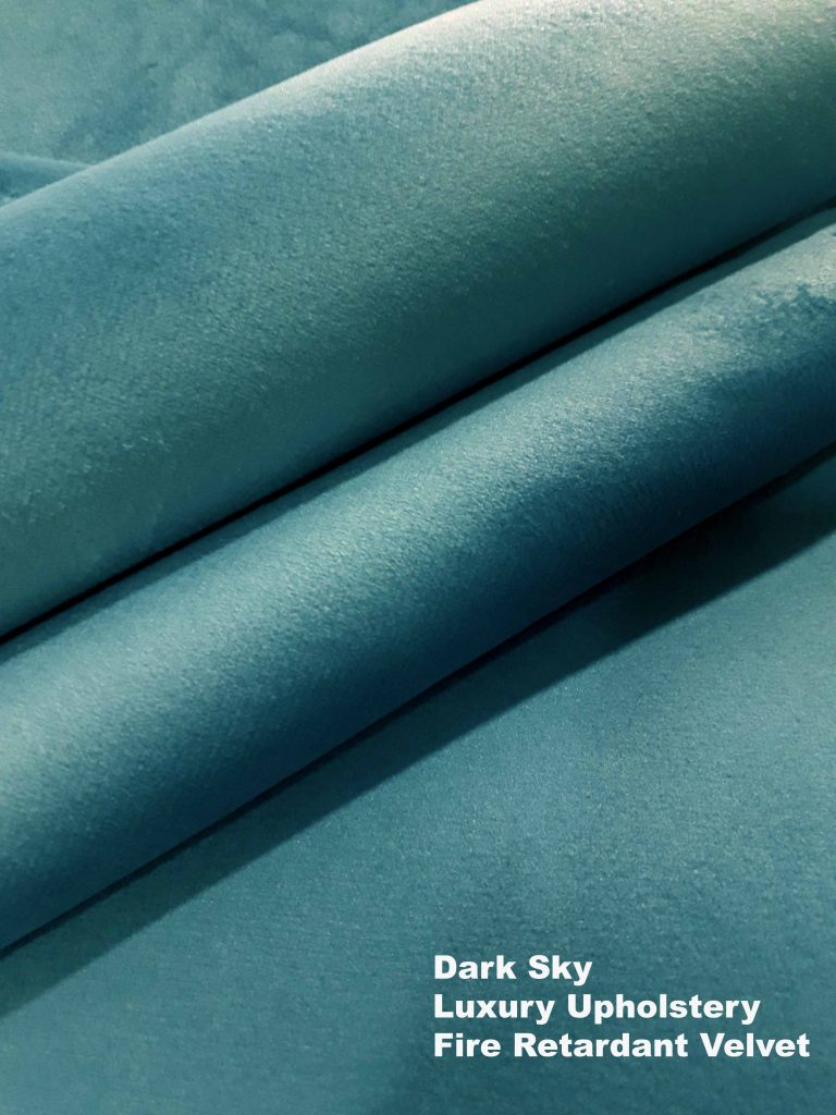
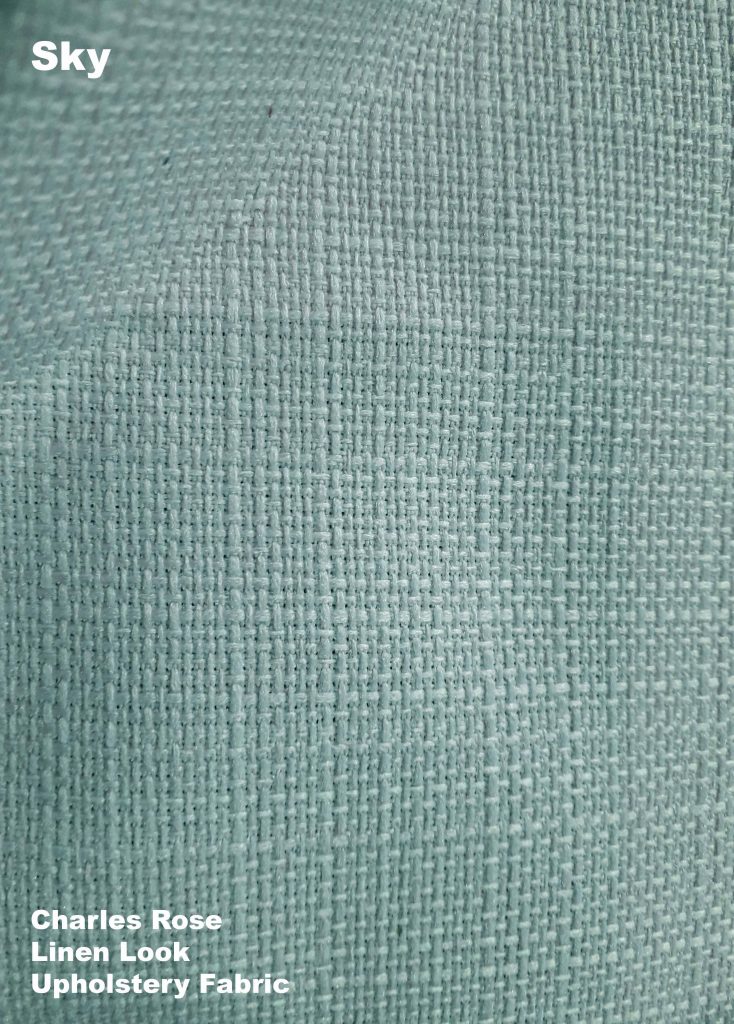
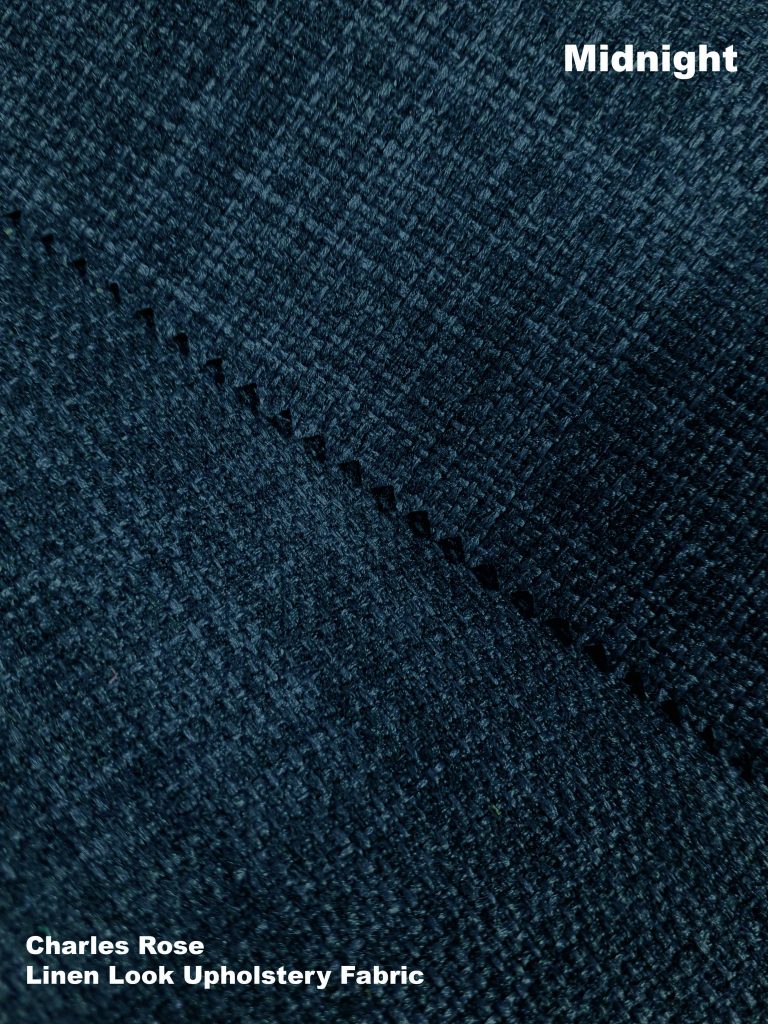
If you want to stick to cool shades of the spectrum, both of these blue shades work perfectly with the grey shades. If you are using avery dark grey then highlight with pale sky blue. And if your main grey tone is lighter then you can get away with a darker tone blue such as the midnight shade.
Alternatively, you could bypass the grey shades and create an interior using these two blues. Both soft in tone they complement each other by creating high and low colour elements in the same palette. As colour groups look best in threes, pale pearl or ivory would add a neutral touch to a cool blue room.
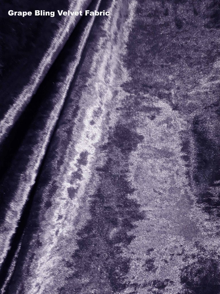
Soft Pinks
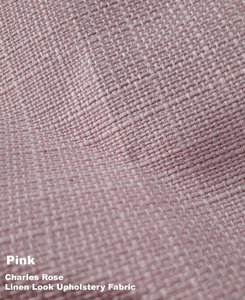
Just like with the blue tones, you could quite easily add grey to this duo to make a good looking trio of colors. Instead of complementing, the pink shades create a contrast to the cold grey shades.
If you have plans to update you existing upholstery, we can help you along with your project. Finding the right colours and textures for your room can be a very in depth process. We can send you samples, give advice, even make bespoke covers for sofas and armchairs.
If you would like samples of our Charles Rose Linen Look upholstery fabric, just call us up on 0121 3592349.
Check out the all of the upholstery fabric here
Fabric UK is your destination for all types of fabric. Whether you’re searching for fabric samples or purchasing by the meter, we make it easy to find exactly what you need.
You can order: Samples, Wholesale, Fabric by the meter
Fill Form for Free fabric samplesSimply visit our website at fabricuk.com or call us directly at 0121 359 2349 for any questions or inquiries.
Visit Our Fabric Showroom
Feel free to visit our fabric showroom anytime – no appointment is necessary!
KBT LTD, Carlton Business Centre, 132 Saltley Road, Birmingham, B7 4TH, United Kingdom
Email Us:
You can reach us at: info@fabricuk.com
Showroom Hours:
- Monday – Friday: 9:30 am – 6:00 pm
- Saturday: 10:00 am – 5:00 pm